1 Data Visualization
1.1 Learning Objectives
ggplot2 enables you to make amazing data visualizations, from basic exploratory plots to dazzling professional-quality graphics used in the Financial Times. In this chapter we’ll focus on using basic exploratory plots that help us find meaning in our data.
By the end of this chapter:
You will be able to explain the basic logic and grammar of
ggplot2, and will use it for basic data visualizations.You will understand the difference between exploratory data visualization and data visualization for communication.
You will explore the resources that will allow you to continue progress towards making increasingly complex, professional quality data visualizations.
1.2 R for Data Science (2e) Chapter: Data Visualization
Work through the R for Data Science 2e Chapter
The rest of this chapter assumes you’ve read through R for Data Science Chapter (2e) 1 - Data visualization. Run the code as you read. We highly suggest doing the exercises at the end of each section to make sure you understand the concepts. The rest of this chapter in this textbook will assume this knowledge and build upon it to learn about Sustainable Finance applications.
1.3 Resources
1.3.1 Cheatsheet
Print, download, or bookmark the ggplot2 cheatsheet. Spend a few minutes getting to know it. This cheatsheet will save you a lot of time later.
1.3.2 Package Documentation
The ggplot2 package website provides extensive documentation of the package’s function and usage. Browse the Reference page to get an initial sense of all of the package’s functions with links to pages explaining them in detail. The ggplot2 extensions gallery showcases the 131 registered extensions that have built unique functionality on top of ggplot2.
1.4 Applying Chapter Lessons to Sustainable Finance
1.4.1 Motivating Goal: What exactly is ESG?
What is ESG?
- A way for investors to save the planet while saving for their retirement?
- A deadly distraction from public policy solutions to climate change?
- A worldwide effort to inject woke political ideology across the financial sector?
In this course we cut through firey/flowery rhetoric by using data to follow the money. We’ll use basic data visualization to start to understand the differences between how a dollar invested in an ESG index fund is different from a dollar invested in a “normal” index fund.
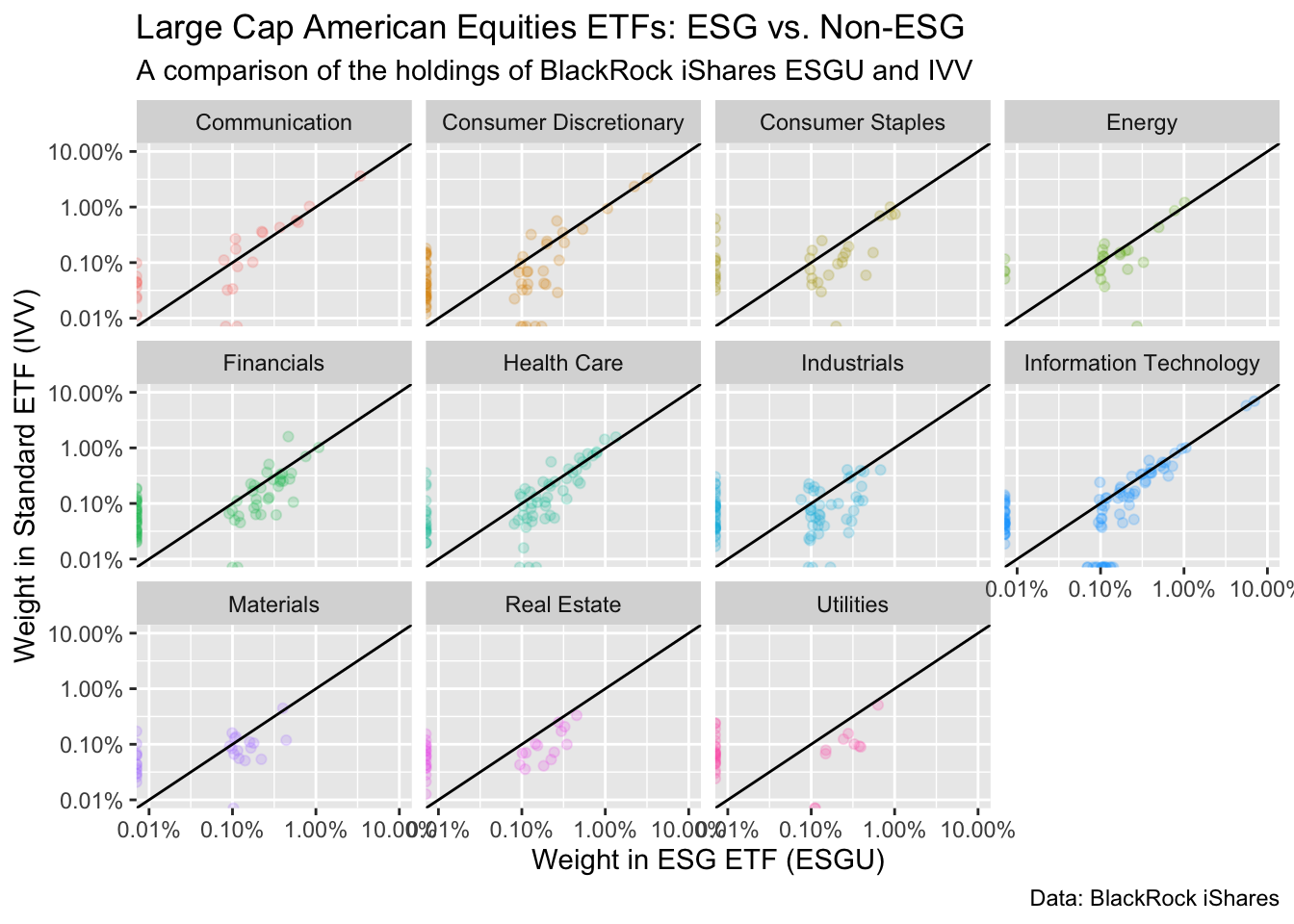
In this section, we’ll learn how to make this exploratory comparing holdings of BlackRock’s iShares ESGU and IVV ETFs. We’ll also learn how to extract insights from this plot that will help us form initial hypotheses and questions about our data that we can follow up on later.
Initial Impressions
Before reading further, take a moment to list out your initial takeaways from looking at this data visualization. Refer back to it after this section and see what you’ve learned.
1.4.2 Data Visualization
Data visualization is a powerful tool for uncovering insights from our data.
There are two types of data visualization:
- Exploratory Data Analysis: a picture is worth a thousand words (…or numbers). We use data visualization to understand distributions and relationships in our data. This doesn’t have to be pretty – it just has to inspire insights that allow us to form initial hypotheses and questions about our data that we can follow up on later. You can learn more about this in R For Data Science (2e) Chapter 9 - Layers and Chapter 10 - Exploratory data analysis.
- Visualization for Communication: After we’ve concluded our analysis, we make pretty chart that strip out all of the clutter and drive home the key points we want to convey to our audience. You can learn more about this in R for Data Science (2e) Chapter 11 - Communication
1.4.3 Our Data
We rarely have the data we want. The comprehensive dataset you want probably doesn’t exist. Or if it does, it costs a lot of money. So we get creative.
Here we use BlackRock’s iShares ETFs to better understand what distinguishes ESG funds from “normal” (non-ESG) funds. There are three factors that make this a useful exercise:
- Size: BlackRock is the world’s largest asset managers. Its iShares subsidiary is global leader in Exchange Traded Funds (ETFs), popular among retail investors for their low cost and tax efficiency. Because of its enormous market share, drawing insights from iShares ESG investment options is more representative of US retail investors options than any other single source.
- Convenient Comps: BlackRock’s biggest (non-ESG) ETF is the iShares Core S&P 500 ETF (IVV). Its biggest ESG fund is the iShares ESG Aware MSCI USA ETF (ESGU) is also a US Equity fund. While ESG isn’t the only difference that separates the two funds’ mandates, it’s a key element. US Equity funds like these two are core holdings for most US retirement portfolios, and the choice between these two funds represents the choice many investors make when they decide between an ESG fund and an non-ESG fund.
- Data Availability: You can download daily data from any iShares ETF webpage that includes securities holdings and weights on a daily basis. This means we can compare the holdings of the two funds on a daily basis and follow the money. In addition, iShares provides documentation detailing the underlying methodology for constructing the ESG index driving ESGU.
1.4.4 First Steps
1.4.4.1 Load Packages
First, we load the tidyverse. It will give messages about any potential conflicts with function names in other packages. This is to be expected, and you can ignore it for now.
library(tidyverse)1.4.4.2 Load Data
Next, we’ll download the dataset from the course GitHub data repository. In the future you’ll learn how to clean up this data on your own. But for now, we’ll focus on finding meaning through data visualization.
# the URL of our data on GitHub
github_url <- "https://raw.githubusercontent.com/t-emery/sais-susfin_data/main/datasets/etf_comparison-2022-10-03.csv"


# read the data from GitHub
blackrock_esg_vs_non_esg_etf <- github_url |>
  read_csv() |>
  # select the four columns we will use in our anlaysis here
  select(company_name:standard_etf)
Rows: 537 Columns: 14
── Column specification ────────────────────────────────────────────────────────
Delimiter: ","
chr (4): ticker, company_name, sector, esg_uw_ow
dbl (7): esg_etf, standard_etf, esg_tilt, esg_tilt_z_score, esg_tilt_rank, e...
lgl (3): in_esg_only, in_standard_only, in_on_index_only
ℹ Use `spec()` to retrieve the full column specification for this data.
ℹ Specify the column types or set `show_col_types = FALSE` to quiet this message.Now, let’s look at our data using dplyr::glimpse, which gives us a convenient way to see the variable names, variable data types (numeric, character, etc…), and the first few rows of each variable.
# use dplyr::glimpse() to get an overview of our data
blackrock_esg_vs_non_esg_etf |>
  glimpse()
Rows: 537
Columns: 4
$ company_name <chr> "PRUDENTIAL FINANCIAL INC", "GENERAL MILLS INC", "KELLOGG…
$ sector <chr> "Financials", "Consumer Staples", "Consumer Staples", "In…
$ esg_etf <dbl> 0.5366803, 0.5522180, 0.4534279, 0.6486836, 0.4407025, 0.…
$ standard_etf <dbl> 0.10574313, 0.15134370, 0.05920732, 0.31168123, 0.1184507…Our dataset has four variables
company_name: the name of the company.sector: the sector of the company. As you can see in the figure above, there are 11 sectors.esg_etf: the weight of the company in the ESG ETF. This sums to 100.standard_etf: the weight of the company in the standard ETF. This sums to 100.
1.4.5 Question 1: How different are these two funds?
Looking at a new dataset, we start with broad questions.
The questions are informed by two factors:
- What questions motivate the analysis? In this case, we’re trying to compare two funds and understand what drives the differences & similarities.
- What kind of data do we have? We have two numeric columns with fund weights, and we have two columns describing each company (name & sector).
We’re trying to start to understand how a dollar invested in the ESG ETF differs from a dollar invested in a non-ESG ETF. We have two numeric variables (the company weights), so let’s make a scatter plot.
g <- blackrock_esg_vs_non_esg_etf |>
  ggplot(aes(x = esg_etf, y = standard_etf)) +
  geom_point()

g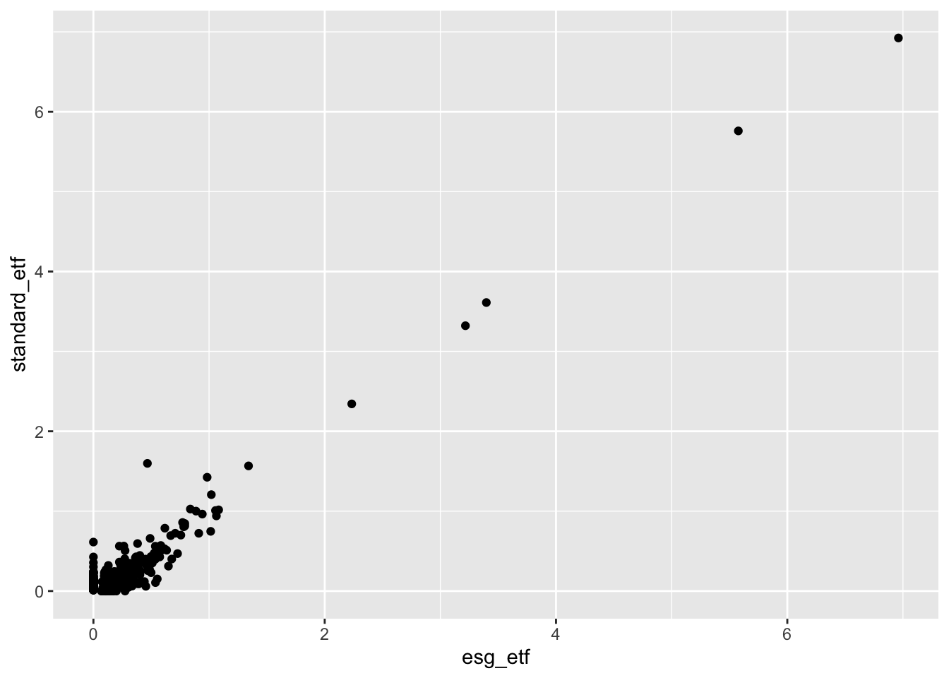
Three factors pop out from this initial exploratory plot:
- Outliers: There are a small number of companies with very large weighs in both indices. Most companies are bunched together in the blob at the bottom left of the graph.
- What companies are the high-weight outliers? We could look at our data and sort by weights to see this.
- We’ll also try changing the axes of our charts to Log10, which may be more informative, given the data distribution.
- Correlation: There appears to be a high level of correlation between the weights of the two funds.
- A lot of companies have similar weights in both funds. What kinds of companies have very different weights in the two funds, and what drives those differences? We’ll explore this further as we go on.
- Exclusions: There are a lot of companies that are in the standard ETF that are not included (0% weight) in the ESG ETF that we see sitting on the Y-axis. There are a smaller number that are included in the ESG ETF but are not in the standard ETF sitting on the X-axis.
- What kind of companies are excluded from each fund? Are there trends by sector?
- Are exclusions driven by exclusively by ESG considerations, or are there other methodological differences between the two investment indices?
At each step, our exploratory visualizations empower us to ask smarter questions of our data and in the outside world:
Ideas for new exploratory plots:
We could change the scale on the charts to better understand the blob in the lower left corner.
We could make a sorted bar chart with the top 10 companies by weight.
We could use faceting or an aesthetic (color, shape, etc..) to see if there are trends by sector.
Questions for outside research:
- To understand what drives fund exclusions, we could start by making a chart looking exclusively at the companies excluded from the two funds, using an aesthetic to detect trends by sector. While this can get us started, and give us some initial hypotheses, we will need to read the fund’s fine print to understand the details.
Reading the Fine Print
To understand the differences between these funds read the fine print. The financial industry is heavily regulated. Funds available to the public are legally required to disclose information about their investment objectives and approach.
Start by reading the product briefs on the ESGU and IVV websites. Don’t be lazy. They are 2 pages with pictures.
What differentiates ESGU and IVV?
In what ways are they similar?
Does the information in the product briefs give us insights into what we’ve seen in the data?
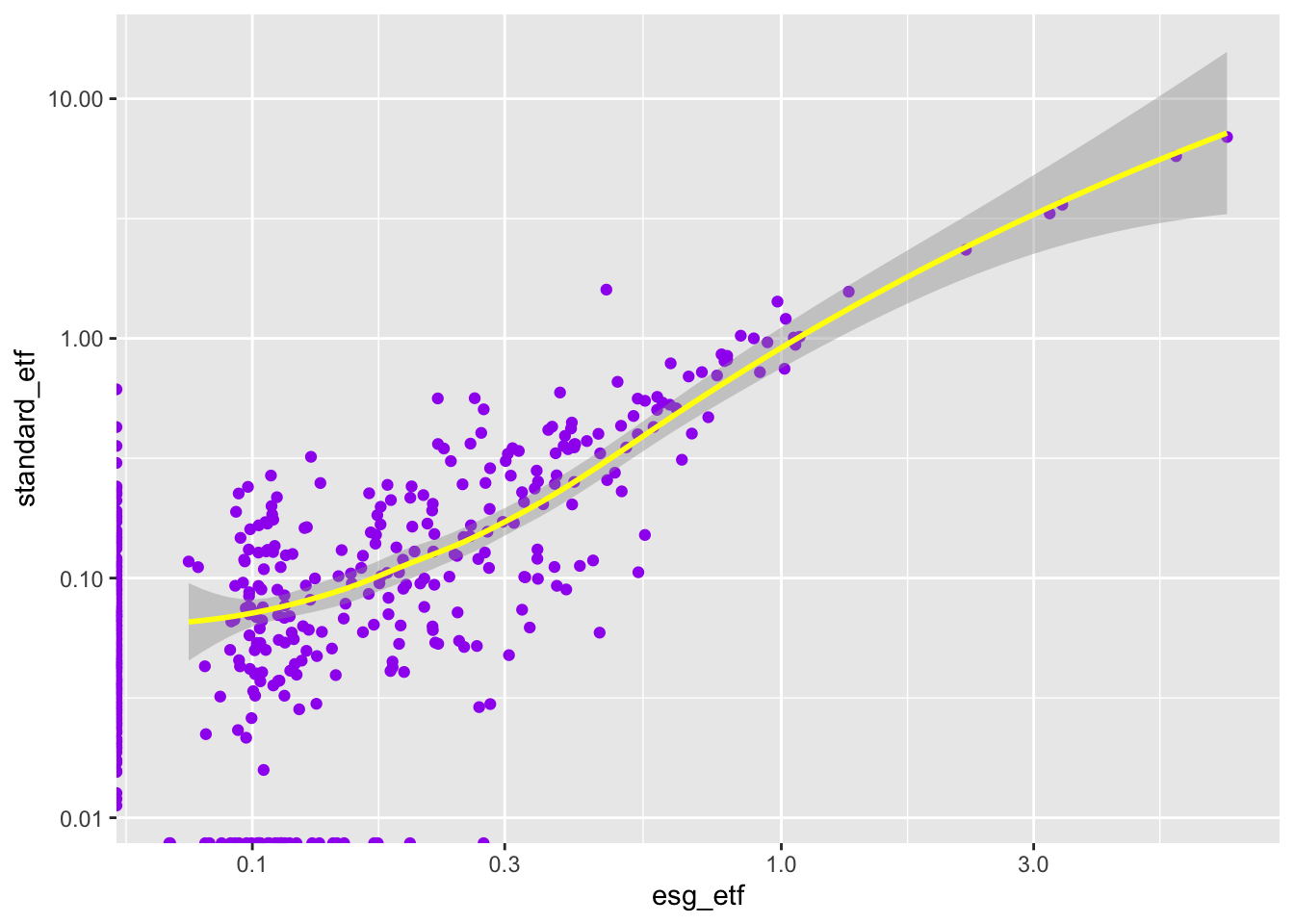
1.4.6 Step 2: Adjust the Axes
We’ll try using a log10 scale on the axes to better understand the blob in the lower left corner.
g2 <- g +
  scale_x_log10() +
  scale_y_log10()

g2
Warning: Transformation introduced infinite values in continuous x-axisWarning: Transformation introduced infinite values in continuous y-axis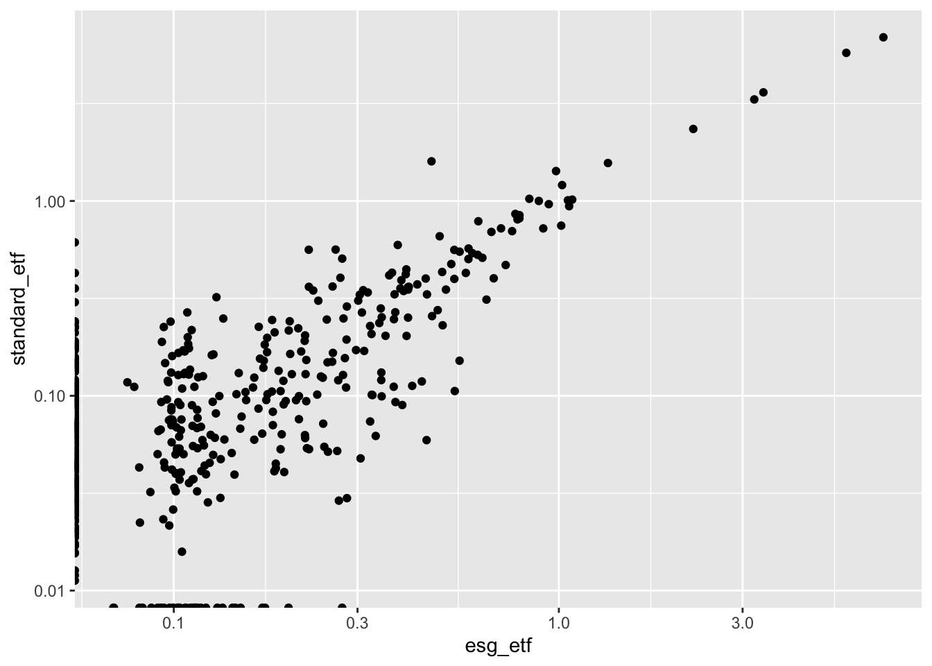
Wow. That’s a much more informative view of the bulk of companies in the two funds. Notice on the Y-axis that the label goes from .01 to .10 to 1.0. This is because we’re using a log10 scale.
We see an warning message in the console above the plot. This is because we have a 0 value in our data. The log of 0 is undefined.
log10(0)[1] -Infggplot2 is smart enough to fix this and show us our zero weighted companies in the plot anyways. For now, that is good enough.1
1.4.7 Step 3: Map Sector to an Aesthetic
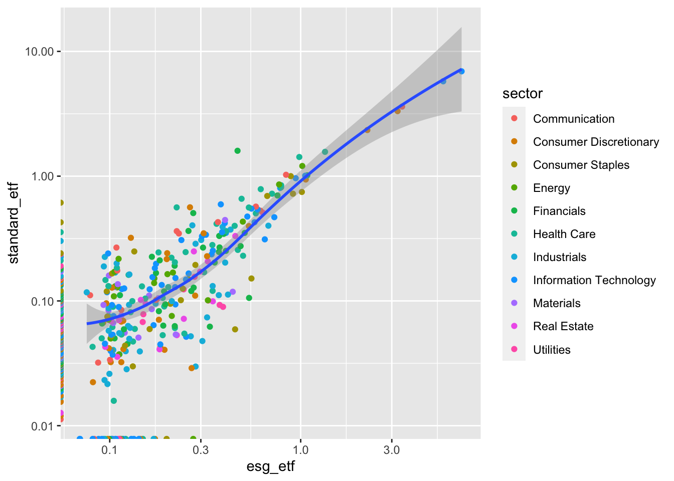
g3 <- blackrock_esg_vs_non_esg_etf |>
  # add sector as an aesthetic mapped to sector in aes()
  ggplot(aes(x = esg_etf, y = standard_etf, color = sector)) +
  # everything else is the same as above
  geom_point() +
  scale_x_log10() +
  scale_y_log10()

g3
Warning: Transformation introduced infinite values in continuous x-axisWarning: Transformation introduced infinite values in continuous y-axis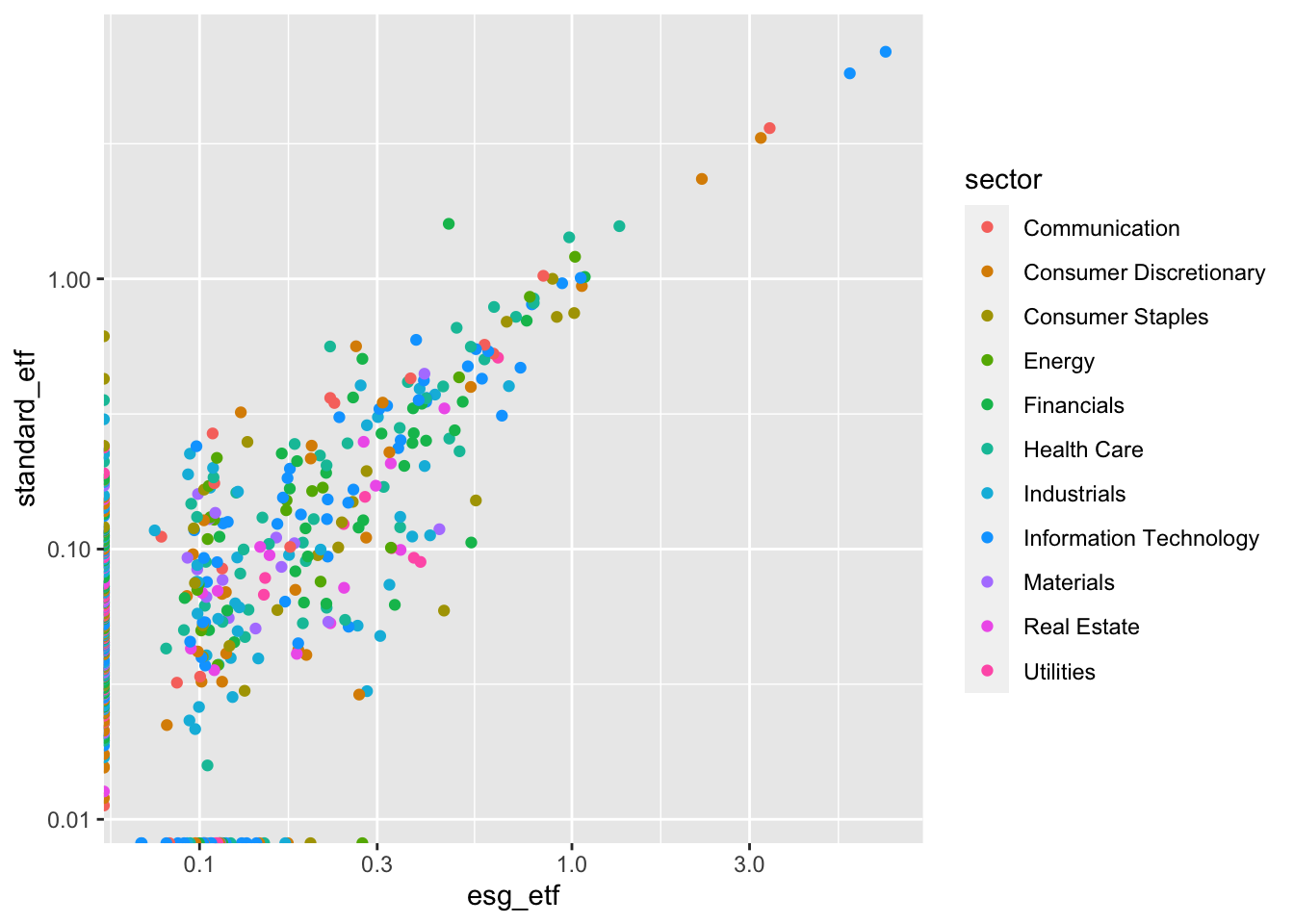
What does this show us?
Sometimes colors make patterns in our data pop out immediately. Using an example from the R For Data Science 2e Chapter, you don’t need to look at the chart long to see that Gentoo are big ass penguins.
library(palmerpenguins)
penguins |>
  ggplot(aes(x = flipper_length_mm, y = body_mass_g, color = species)) +
  geom_point()
Warning: Removed 2 rows containing missing values (`geom_point()`).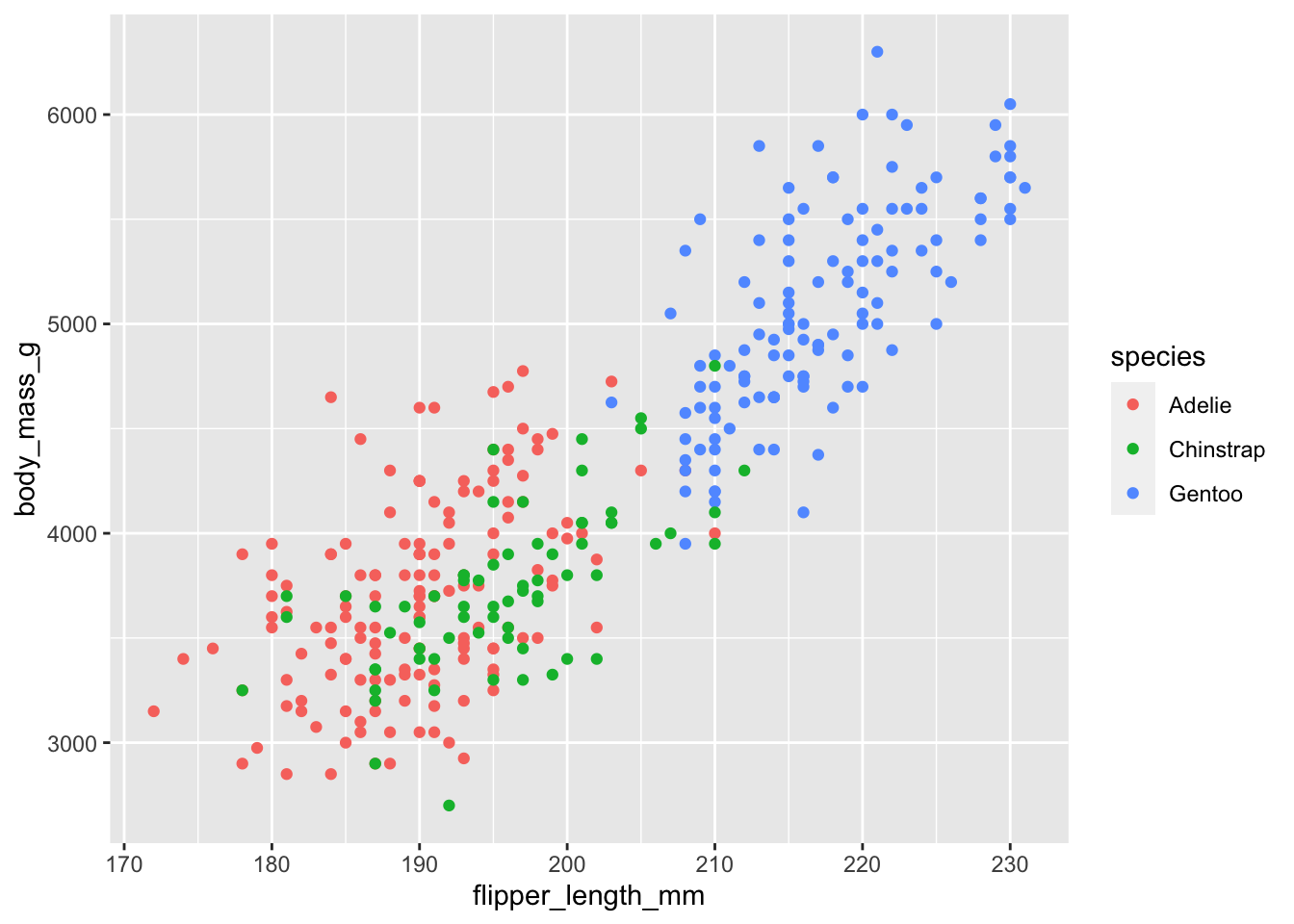
Our chart is more subtle. Our colors are intermingled. And that is data too. We know that there are no screamingly obvious trends by sector, which is interesting. Maybe this means that ESGU picks ESG “winners and losers” by sector?
There are subtle patterns that we should follow up on: exclusions. The dots on the y-axis (included in IVV but excluded from ESGU) are multi-colored. The dots along the x-axis on the bottom edge (included in ESGU but excluded from IVV) appear to contain more blue dots – Information Technology. This is worth exploring later.
1.4.8 Step 4: Adding a 45 degree line
The R for Data Science 2e Chapter demonstrated adding smoothers to a scatter plot in order to detect patterns in the data.
In our case, we’re looking to see how company weights are different between two funds. We can eyeball it, but the axes are slightly different. We can use geom_abline() to create a 45 degree line.
g4 <- g3 +
  geom_abline()

g4
Warning: Transformation introduced infinite values in continuous x-axisWarning: Transformation introduced infinite values in continuous y-axis
In our case, the 45 degree line has an intuitive interpretation. Any (non-zero) value that is above the line has a higher weight in IVV. Any value below the line has a higher weight in ESGU.
What patterns emerge?
- ESGU - Exclusions + Overweights: as discussed above, ESGU does not include a significant number of companies included in ESGU. The flip side of that is that it has a higher weight for many of the remaining companies.
1.4.9 Step 5: Faceting
If we look at each sector separately, do any patterns emerge? we’ll use facet_wrap() to make small plots for each sector.
g5 <- g4 +
  facet_wrap(~sector)

g5
Warning: Transformation introduced infinite values in continuous x-axisWarning: Transformation introduced infinite values in continuous y-axis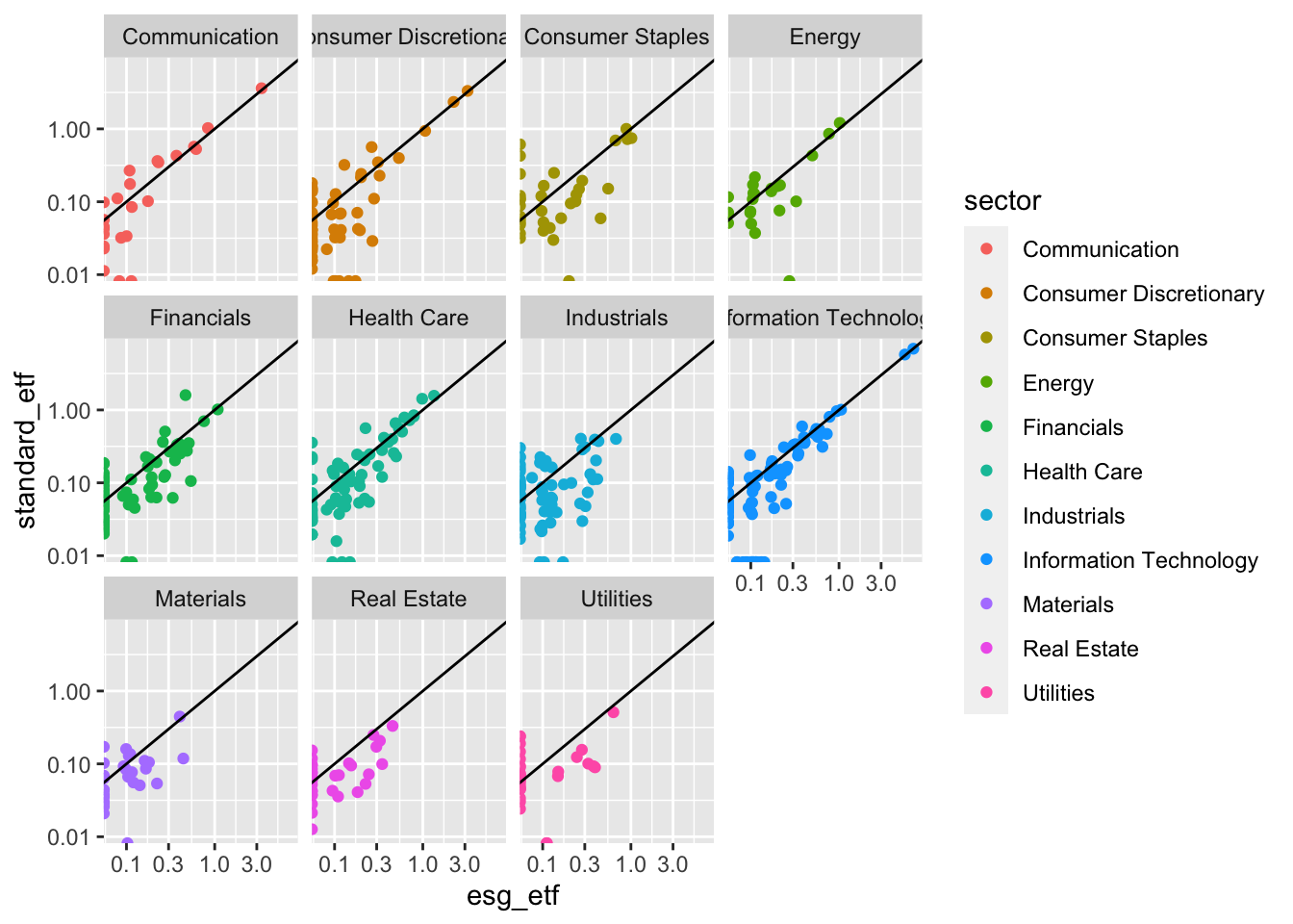
In this version of the chart sector is double encoded, meaning it is represented both by color and by separate facets. The redundancy of double encoding2 helps reinforce the difference between groups and make differences more clear to the viewer. The R for Data Science Chapter did this by using color and shape to represent penguin species.
What Sectors Stand Out?
Look at each sector, what stands out to you? Make a list of your hunches and questions.
1.4.10 Step 6: Make it pretty
The chart above is interesting. And when you’re just exploring for yourself, you could leave it like that. You know what this data is. You know what’s on the Y-axis, and what the units are. But your colleague or your boss won’t. So let’s clean this up.
At the top of the chapter we discussed the difference between data visualization for exploration and data visualization for communication. This is a spectrum. No matter how much we clean up this chart, it will always be a exploratory plot. It doesn’t have a clear message. Nevertheless, you may want to share this plot as part of an analysis for colleagues who want to see all the details, not just the conclusions.
Steps to make this professionally shareable:
Add titles.
Clean up the axes and add labels.
Add a caption with the data source and other pertinent information.
The code below is annotated. Take time to go through each part.
blackrock_esg_vs_non_esg_etf |>
  ggplot(aes(x = esg_etf, y = standard_etf, color = sector)) +
  # make points translucent using alpha so we can better see overlap.
  geom_point(alpha = .6) +
  # make the x and y axes be equal using limits argument.
  # format the axes as percent to make the units clear
  scale_x_log10(limits = c(.01,10), labels = scales::label_percent(scale = 1)) +
  scale_y_log10(limits = c(.01,10), labels = scales::label_percent(scale = 1)) +
  geom_abline() +
  facet_wrap(~sector, ncol = 4) +
  # get rid of the legend. Because each facet is labeled, it just created clutter.
  theme(legend.position = "none") +
  # Give titles and subtitles that tell your viewer what they are looking at.
  labs(title = "Large Cap American Equities ETFs: ESG vs. Non-ESG",
       subtitle = "A comparison of the holdings of BlackRock iShares ESGU and IVV",
       # Always label your axes.
       x = "Weight in ESG ETF (ESGU)",
       y = "Weight in Standard ETF (IVV)",
       # Tell people where the data came from.
       # You can also include the date of the data when relevant.
       # You can put your name here, and let the job offers & promotions roll in.
       caption = "Data: BlackRock iShares")
Warning: Transformation introduced infinite values in continuous x-axisWarning: Transformation introduced infinite values in continuous y-axis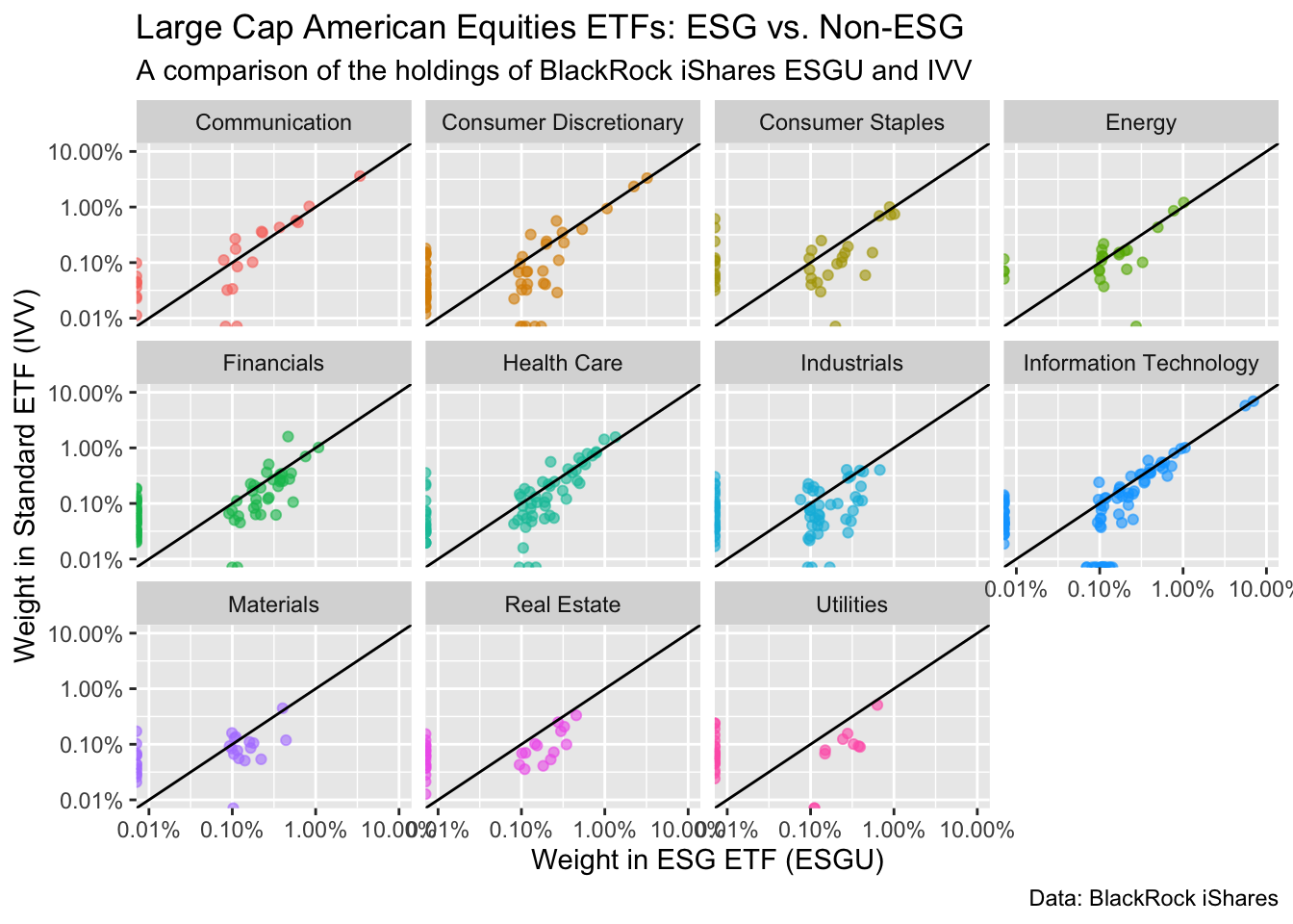
1.5 Practice Problems
1.5.1 Using esquisse to practice ggplot2 basics
Esquisse is an R Studio Addin that provides a graphical user interface (GUI) to create basic ggplot2 plots with your data. It’s an excellent way to learn the logic of ggplot2 and the power of mapping data to aesthetics. After you make a plot, Esquisse let’s you copy and paste the ggplot2 code.
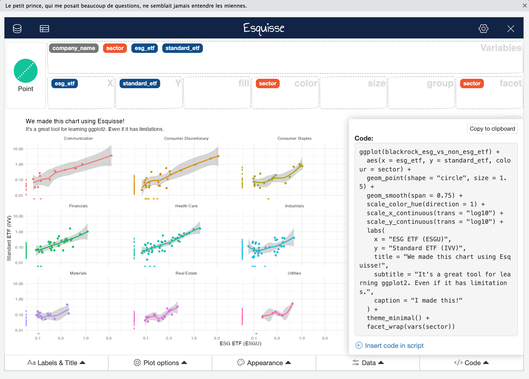
1.5.1.1 Setup Esquisse and read the documents
Many R packages have websites built with the pkgdown package that contain vignettes explaining how to install and use the package, as well as detailed documentation for the package’s functions. You saw the ggplot2 package website at the beginning of this chapter.
Learning to use Esquisse:
Find the Esquisse website. Follow its directions to set up esquisse in R-Studio.
Look at the articles. Find Getting started with esquisse. Read it, and follow along to learn how to use the package.
Explore the menus in the Esquisse graphical user interface. You’ll be using these for the rest of the section
Learning to use new R Packages
A strength of R is high quality documentation in a consistent format. When you want to learn how to use a new package, just look for the website, and start with the packages “getting started” article. If you have questions about a specific function, look on the reference section of the package website (or use ?function_name in your R session).
1.5.1.2 Homework problem 1: Recreate the chart above in Esquisse
Import
blackrock_esg_vs_non_esg_etfLook at the screenshot above. Assign your variables to the correct aesthetics, and choose the correct chart type.
Explore the menus at the bottom of the screen.
Change the x and y axis to log10.
Add a smoother (there is no 45 degree line option in esquisse).
Add descriptive titles and labels. Put your name in the caption.
Change the color palette to a different color palette of your choice.
Copy and paste the code into your homework.
1.5.1.3 Homework problem 2: exploring the outliers
We’re going change our data from wide to long. Don’t worry too much about understanding this now, as we’ll cover it in detail in the coming weeks. Just know that it will enable us to compare our two ETFs in new ways.
blackrock_esg_vs_non_esg_etf_long <- blackrock_esg_vs_non_esg_etf |>
  # we'll learn a lot more about long data & pivot_longer() in future weeks.
  pivot_longer(cols = contains("etf"), names_to = "fund_type", values_to = "weight") |>
  # case_when() is like an extended "if else"
  mutate(fund_type = case_when(fund_type == "esg_etf" ~ "ESG ETF (ESGU)",
                               fund_type == "standard_etf" ~ "Standard ETF (IVV)"))

blackrock_esg_vs_non_esg_etf_long
# A tibble: 1,074 × 4
company_name sector fund_type weight
<chr> <chr> <chr> <dbl>
1 PRUDENTIAL FINANCIAL INC Financials ESG ETF (ESGU) 0.537
2 PRUDENTIAL FINANCIAL INC Financials Standard ETF (IV… 0.106
3 GENERAL MILLS INC Consumer Staples ESG ETF (ESGU) 0.552
4 GENERAL MILLS INC Consumer Staples Standard ETF (IV… 0.151
5 KELLOGG Consumer Staples ESG ETF (ESGU) 0.453
6 KELLOGG Consumer Staples Standard ETF (IV… 0.0592
7 AUTOMATIC DATA PROCESSING INC Information Technology ESG ETF (ESGU) 0.649
8 AUTOMATIC DATA PROCESSING INC Information Technology Standard ETF (IV… 0.312
9 ECOLAB INC Materials ESG ETF (ESGU) 0.441
10 ECOLAB INC Materials Standard ETF (IV… 0.118
# ℹ 1,064 more rowsThis has stacked our data, so that fund_type is now a categorical variable that we can map to an aesthetic. This allows us to do useful analysis using ggplot2.
After running the code above, reload the Esquisse GUI. Import
blackrock_esg_vs_non_esg_etf_long.Go into the Data tab, and limit the
weightvariable to companies over a 1% weight.Choose a
Pointchart and assign variables to aestheticsweightto thexandsizeaesthetics (double encoding).company_nametoyfund_typeto color
Change the color for the ESG fund points to be green colored, and the non-esg fund to be grey.
Add meaningful titles and labels. Put your name as the caption.
Copy and paste the code to recreate the chart in your homework. Annotate the code using
#s to explain what each part is doing.Write a short reflection (a few sentences) on how to interpret this chart, and what it tells you about the large outliers in the dataset.
1.5.1.4 Homework problem 3: Make your own charts with esquisse
Now that you understand the basics, its time to make your own charts. Think about the questions our charts have raised about the data.
- Make 2 new charts that explore interesting questions in the data. Add meaningful titles and labels so viewers know what they are looking at.
- Copy and paste the code so you can recreate the charts in your homework. Annotate the code to explain what each section is doing.
- Short explanation of what each chart illuminates.
1.5.2 Understanding ggplot2 grammar
Understanding ggplot2’s grammar will empower you to make data visualizations that fit the circumstances of your data and where it will be presented.
1.5.2.1 Homework problem 4: Understanding aes()
Based on what you learned in the R for Data Science 23 Chapter:
recreate these three charts.
Annotate your code.
Below each one, write a short note explaining the
ggplot2grammar difference that makes it work.
1.5.3 Resources for learning to make new charts
Beyond the ggplot2 package website, there are many high quality free resources for learning to make cool new ggplot2 charts.
Here we’ll start with two, the R Graph Gallery, and the R ggplot2 Extensions Gallery.
1.5.3.1 Homework problem 5: make a new chart from the R Graph Gallery
Take a look at the R Graph Gallery.
Choose a chart type that you think might shed light on our data.
Copy the example and make sure you understand how it works.
Use that to build a new chart for our data, and explain what the chart tells us about the data. As always, add informative titles and labels.
1.5.3.2 Homework problem 6: make a new chart from the ggplot2 Extensions Gallery
Look at the
ggplot2Extensions Gallery.Choose an extension, and install it.
Use that to build a new chart for our data, and explain what the chart tells us about the data. As always, add informative titles and labels.
The Software Carpentry website offers a more elegant fix.↩︎
You can triple encode if you want. Go wild, friend. Clutter is the only limiting factor.↩︎